
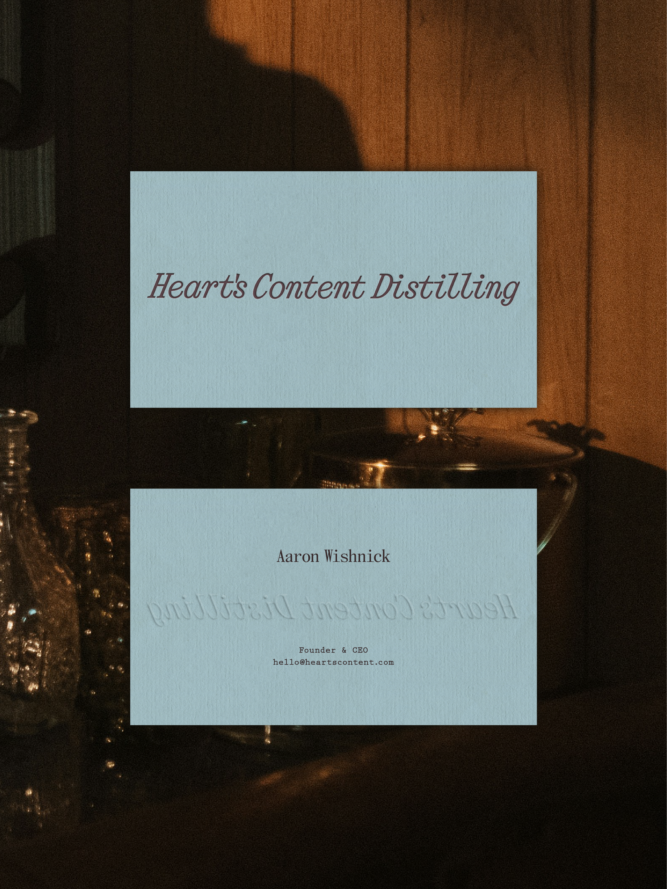
Heart’s Content
Brand Strategy & Design
Packaging Design
current/in progress
Heart’s Content is a distillery offering the unique taste of The Catskills and delivers exceptional quality that leaves a lasting impression. We wanted to develop a brand identity to represent the intimacy of art and craft of their distilling practice while also firmly set in the woodsy, atmospheric Catskills.
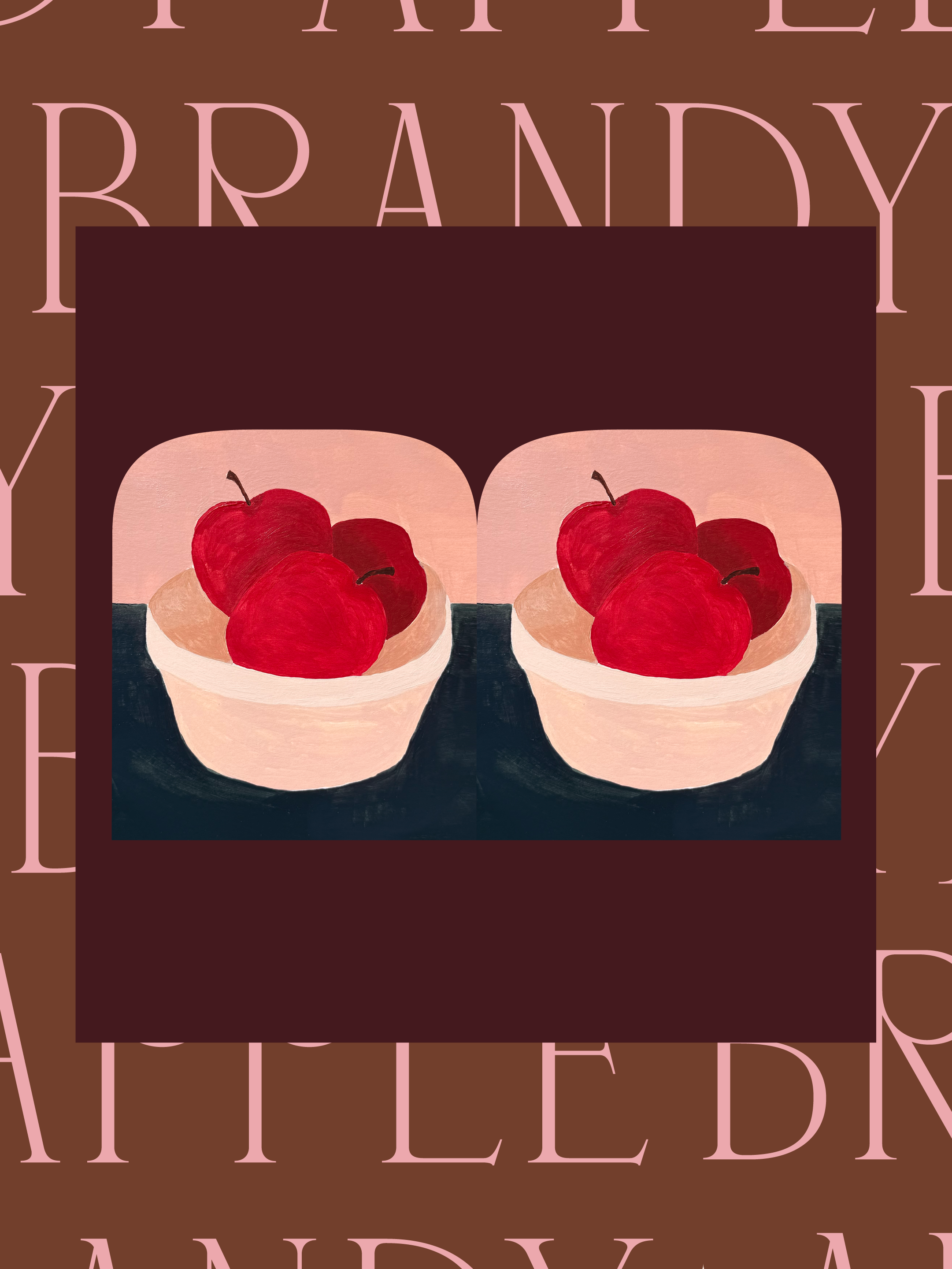
Born from a desire to master the art and craft of the time-honored tradition of distilling, Heart’s Content Distilling creates apple brandy and other fruit-forward spirits known for their quality, ability to delight, and playful experimentation. Distilled locally in the heart of the Catskills, Heart’s Content produces small batches, offering flavor that’s artisanal and complex, yet approachable and familiar.
The brand identity draws inspiration from the beauty and atmosphere of the Catskills—a region known for generations of farmers, craftspeople, and a down-to-earth spirit where relief is found within the landscape. Warmth, simplicity, and craft are characteristic of the brand’s visual language. By using these elements and leaning into 19th-early 20th century American Folk Art, the identity acknowledges and honors the Catskills’ cultural history and its present.
The typography chosen refers to rustic craftsmanship with contemporary refinement, a nod to the Catskills’ traditions while maintaining the elegance you’d expect from a premium spirit. Grounded without feeling heavy, sophisticated without feeling precious.
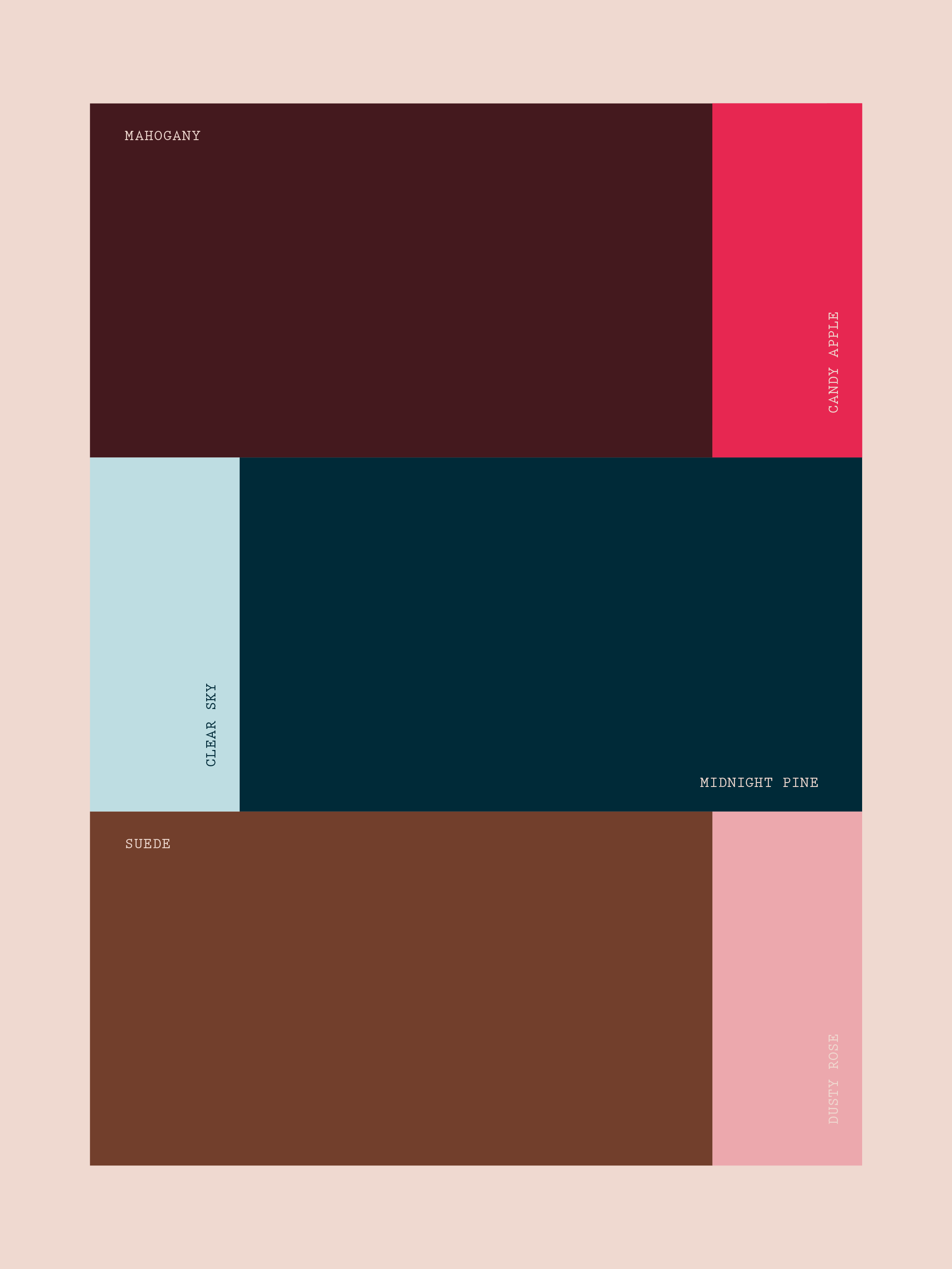
Color for the brand reflects the batch it’s intended for, changing with each type of spirit created. For this batch of apple brandy, the color palette is inspired by the landscape. Mahogany and suede anchor the brand in natural materials while candy apple and dusty rose introduce a playful vitality. Midnight pine and clear sky round out the system, evoking the region’s forests and open horizons.
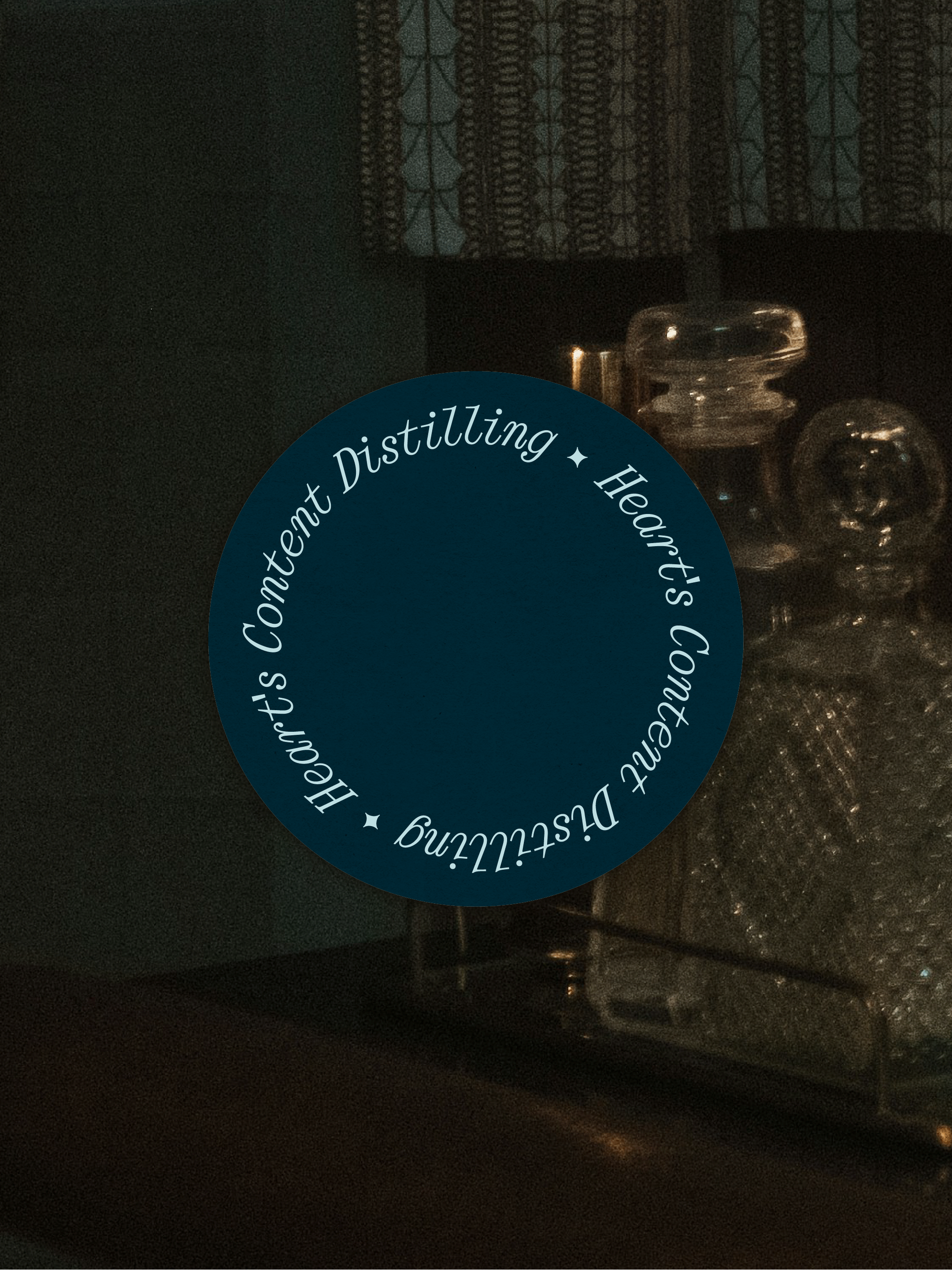
The illustration style is inspired by American Folk Art: flat simplified perspective with vibrant blocks of color and visible brushstrokes. While researching historical visual references, stereograph images were a recurring theme and this shape is used as a visual motif, framing the brand’s artwork.